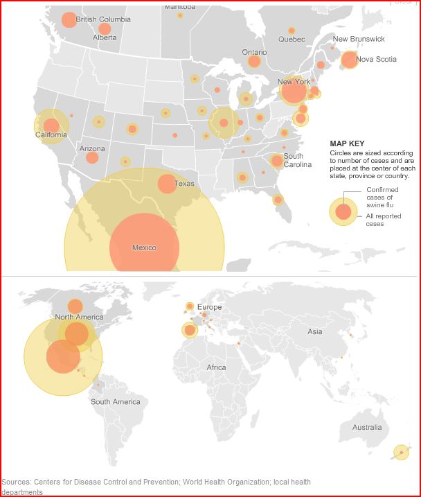
[Map as of early afternoon on May 4th, found at the NY Times.]
Compare the dark circles (confirmed cases) for Mexico, New York and Nova Scotia in the top part, or Mexico and the U.S. in the lower part of the map. It’s easy to see which has more cases of the flu — but how many more? Which would you guess is the closest estimate:
Mexico : New York : Nova Scotia
- = 7:3:2 or 20:5:3 or 16:2:1?
U.S. : Mexico
- = 1:2 or 2:5 or 3:7?
Is a Picture Worth as Much as They Say?
The correct ratios were:
- Mexico : New York : Nova Scotia = 590:73:33 ≈ 16:2:1.
[A closer estimate would have been 72:9:4, but I was trying to keep the numbers small.] - U.S. : Mexico = 278:590 ≈ 1:2.
[Or 8:17 for a closer estimate.]
How did you do?
I find this type of circle graph inherently misleading. The size of the circles relates to the number of cases of flu — but by “size”, does the designer mean diameter or area? In this case, the graphic designer chose area, which is certainly the better choice. Mark at Good Math, Bad Math pointed out what happens when the designer chooses diameter.
Unfortunately, my eyes are poorly calibrated for area. The Mexico circle in the top graph does not look 8 times as big as the New York circle to me. And the New York circle definitely does not look twice as big as the one on Nova Scotia. Not even close.
Yet 73:33 = 2.21, so it is actually MORE than twice as much.
Please Share Your Advice
Do your eyes play tricks with this sort of diagram, too?
Do your students prepare graphs or other types of presentations? Do you have any favorite teaching resources? How do you help your students balance clarity of communication with creative expression?
Do you teach them How to Lie With Statistics?
I had a similar dilemma at work recently. I was writing a script, which would end up being used by many, to generate some experimental printing resource (I work for HP’s large format printing division), and had a parameter that represented an area of influence… I chose the area over radius, and have since kept receiving complaints along the line of “how come I make it twice as big, and it barely grows 40%?”
I’m glad to know the problem is not just me, but it does make things hard for programmers and graphic designers.